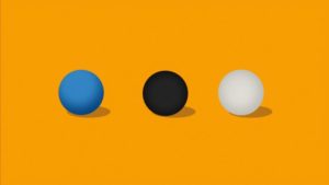
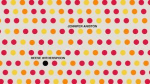
When creative directors Angus Wall and Hazel Baird pitched the concept for the main title design for the Apple TV+ series The Morning Show, the abstract sphere idea was a major hit with subtle undertones and subcode on human characteristics and behaviors. The idea was broad enough and didn’t hone in on one theme.

The abstract design of the main title sequence includes colorful yellow, orange, red, blue, white, and black spheres/circles with a full story embedded to reflect the show. “Apple wanted to make sure we had a story thread throughout in a graphical way. At the beginning, after the sun spheres go from left to right and drops down following each other like sheep, we see this black sphere. The spheres drop down to go against the grain and want to do something different. That’s when the black sphere starts to push away as it becomes angry. The sphere wants to get in on that and they’re like go away. We see the shadow sphere get bigger, as it’s supposed to be intimidating to the small yellow sphere. It drops down into a pit full of other spheres, which are exactly the same as it. When we come out of that, we’ve got this big ego that’s getting deflated,” Baird enlightened.
The creative director continued, “In 38 seconds, the blue sphere comes over the black sphere and produces all these other spheres, it’s scared and that’s what it represented. As we push past that, it goes into nine yellow spheres that form a grid and its conformity; I don’t want to be the same as everyone here, I want to change, I want to get out. It squeezes out of the conformity, so it’s not there anymore.”

The middle portion of the sequence includes a vampire and peekaboo section. “It goes into this vampire section where the black sphere is sucking the life out of the yellow sphere then becomes bigger. It’s when someone basically takes your ideas. The peekaboo section is when the sphere has a barrier, they don’t want the yellow sphere to see the white sphere. As it flips up, it goes up the hill. This is a metaphor for obstacles in our way. We are trying to get higher up in the work force and it doesn’t always work out. We get pushed down, one of the characters wants to progress, and they’re unable to,” Baird explained.
The title design finishes with a maze portion. The creative designer described, “When we get to a minute, this is our little maze; I’m trying to find you and I want you to stay away from me, meaning people coming together and then being shelved out. We can’t be with this person, so we are just going to interrupt you, you can’t have this job, I’m going to get it instead. The pendulum is boring, tedious, back and forth. This is a metaphor at the very end where the black sphere jumped on the set, trying to get to the top. When it’s at the top, it goes down, then it realizes that and they’re just the same as everyone else, where I’ve gotten to the top and nothing’s really changed. That’s when it’s goes into The Morning Show logo.”

Each sphere was a separate entity that wasn’t connected or tied to specific character. Baird expressed, “The idea was we didn’t want to assign each character to a certain scenario. We tried not to think about individual people in the show. Angus was very adamant it shouldn’t be assigned to a person on the show, the reason for that is because people change. We wanted to keep it really ambiguous.”
“It’s a whole story that’s being methodically thought out. We have these different scenarios, how are they going to connect, and how can we tell a story with that. In any main title, telling a story is really difficult. The spheres don’t have any features, it’s non expressive, so we have to do it by the way we were animating. Angus and I wanted people to make up their own minds to take different thoughts from all these ideas because all of them have a double meaning.”

Creative director Hazel Baird is a previous winner of the News & Documentary Emmy Awards and the Royal Television Society (UK) for her design in WWII from Space with a nomination from the Cinema Eye Honors Awards for her contribution for The Inventor: Out for Blood in Silicon Valley. This is the first Primetime Emmy nomination for creative directors Angus Wall and Hazel Baird. The Morning Show is nominated for a Primetime Emmy in the category of Outstanding Main Title Design.
Primetime Emmy Nomination:
Outstanding Main Title Design:
Angus Wall, Creative Director
Hazel Baird, Creative Director
Emanuele Marani, Lead Designer
Ej Kang, Lead Animator
Peter Murphy, Animator
Erik Righetti, Animator
You can watch the show’s main title sequence below:


