On Carol, the story of a department store clerk who falls in love with an older married woman, the production team consisting of Becker, Haynes, cinematographer Edward Lachman, and costume designer Sandy Powell spoke as a group about the look of the film. They wanted to create a post-war, pre-Eisenhower 1952 New York City. The director was influenced by renowned photographers of the time such as Saul Leiter, Ernst Hass and Esther Bubley.
“Todd’s so easy to talk to and has such wonderful references. You start talking about one thing and it leads to another. He had a lot of the same cultural references, so I find the collaboration with him extremely artistically rewarding, and personally very fun and exciting,” revealed Becker. “He’s just great to work with.”

“The colors are just very, very different. I can’t even look at a modern paint deck when I’m doing a period movie,” explained Becker. “I brought Pat Spratt to Cincinnati. She’s an artist and she’s great at color mixing. She loves working with these challenges like, here’s this old paint chip can you match it? She’ll match it and then we will do different variations on it.”
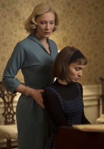
Becker wanted the color to be true to the time period, but all time periods have every color of the rainbow, so it is a case of choosing the right colors for the film. For Carol, the team choose a lot of greens that the director called “sour greens and yellows,” as well as “muddy pinks” that were a bit closer to the ’30s and ’40s than to the ’50s because it is the older New York that has not gone into the ’50s yet.
 “They’re also these disturbing colors that express a lot of what’s going on in the story. They’re not comforting colors,” said Becker. “They’re a little bit dirty looking. Not dirty like dirt, but they are a bit muddied up. I love those colors in general. I think they photograph beautifully. In this particular case, I think they were great for the storytelling.”
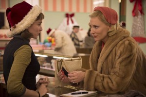
Not a lot of color is used in the film because the photography and references from the period contained the neutral colors and textures of New York City that included a lot of brown and brick, pavement and cement. Most of the movie has that palette with touches of color in the interiors and wardrobe, such as the red worn by Carol that stands out against the muted background of the urban landscape.
Becker elaborated, “When you are so judicious in the use of color, when you use color, it really stands out. That makes you think of Carol’s lipstick and her nails and Therese’s hat, but if red was all over the place, you wouldn’t notice those things as much. I think color palette planning is one of the most important aspects of production design along with the costume designer and also talking to the DP. It’s something I really think about when I am creating the world of the movie.”
 As a New Yorker, Becker is very familiar with the city and culture. She has seen changes, including all the building in the last 15 years. A lot of the old New York is no longer there, or is hard to find, so the company shot in Cincinnati. Although there were challenges in Ohio, Becker feels that they found the old New York more easily than they would have in New York city.
“If all of the movie had taken place on the upper eastside, we probably could have shot it in New York, if we could have gotten permits, because that’s the one neighborhood that hasn’t changed very much, but the rest of Manhattan, it’s like another city,” stated Becker.
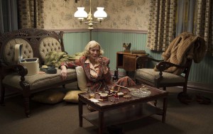
In the film, there is a wealth distinction between Carol’s world and Therese’s world, which automatically generates different design approaches. Carol lived in a big house with luxurious furniture, beautiful wallpaper, while Therese lived in a walk-up apartment that had a bathtub with a lid in the kitchen. Becker remembers shooting during the 1990s in Hell’s Kitchen apartments that still had those. The character brushes her teeth in the kitchen because she only has a toilet in the closet. Essentially she is living in a tenement apartment of the era.
“I think that is really beautiful in the opening scene where she is waking up, and turning on the stove for heat, and brushing her teeth in the sink. You see how she is living. And then Carol has this big beautiful house, but both of these places are austere for both the same and different reasons,” explained Becker.
During that time period, and in decades afterwards, people did not have a lot of material possessions whether they were rich or poor. It wasn’t the throwaway materialistic society of today that Becker believes started in the 1980s, so if she sees too much set dressing in a period piece, it takes her out of the period. One of the things she tries to do in a period movie is limit the amount of actual interior set dressing.
Another consideration in the production design that relates to the two characters is that Carol is in a big house, but her life is in a shambles. She is getting a divorce and her future is uncertain. She does not inhabit the house as a happy person. Therese, as a young woman who does not know herself, does not inhabit her apartment as a fully realized person. So the austerity of the time period that was accurate, also worked for the two characters. In different ways, they have empty lives.
The most exciting design for Becker was the toy department, the production’s biggest set and where the biggest chunk of the design budget was spent. The company wanted to create the set within an existing location. They looked at a lot of different places, including shut down department stores, but in most cases they were wrong. They even picked a high school gymnasium, but there was no heat or water, and at the last minute that choice fell through. Set decorator, Heather Loeffler, was shopping in an old fabric store in Mill End, Ohio and thought some floors in the building might work.
“We went over there and it was amazing. This one floor was just perfect. It had all the elements we needed. In a sense it was a blank palette, but it had the columns, and it had walls and windows that we could paint,” shared Becker. “It was filled with stuff, but we immediately did a ground plan and started clearing things out, and built a model, and started creating the toy department. I think I pulled an all-nighter on that set. It was all-consuming, but exhilarating.”
In addition to building the set, the art department graphically designed and fabricated about 25 toy boxes based upon old ones. Loeffler found a box manufacturer in Cincinnati to produce them. Although Becker had never before designed packaging to that extent, it was fun. She noted that Cincinnati was a well-to-do town and had great sources for things like “neon and signage and this box manufacturer.”
The film was mostly a location-driven movie, but the small crew of the art department started almost every single location from scratch. The team created pretty much everything that is seen from the motel rooms that began as blank white canvases to the high-end wallpaper at the McKinley.
“I love before-and-after pictures because they really show the work we do. So many people, even art department people, think that you just walked in. In this movie, I just want to emphasize that’s the opposite of true,” Becker concluded. “That’s our creation up there on the screen. I’m very proud of it. I had an amazing time. I’m really proud about how hard everybody worked and how dedicated they were to the movie.”


