Recreating the world of Hitchcock was a project production designer Judy Becker found attractive as soon as she read the script. Becker, best known for her work on Brokeback Mountain (2005) and The Fighter (2010), the latter of which earned her an Art Directors Guild award nomination, was thrilled to recreate Hollywood and Hitchcock in the late 1950s-early 1960s period. “It’s always fun to design a period movie and I feel like period needs to be addressed properly in design in films,” she explained. “You need to always show that in any given period you have all of the past present, as well as that year. I think it’s really important to show the layers of time that accumulate.”
Designing a film about a real historical figure set Becker on an intense and extensive research assignment. The study focused on Hitchcock’s world first and extended to the surrounding time. “First I wanted to know everything about what it really looked like – what did their house really look like, what did their bedroom really look like, what did the Psycho soundstage really look like, all the reality possible,” Becker said about her process. “And then going beyond that – what did the time period look like, what did restaurants in 1959 look like, what did other houses look like in 1959?”

Once she was rooted in the reality of the period, Becker moved through the research to storytelling mode to create the many environments in the film. “Something [director Sacha Gervasi] and I had worked out early on during the pre-production process was that there were different worlds in this movie that had to relate visually but also had to be distinct visually.” To accomplish this Becker created a color palette that was entirely true to the period and that could be used in different ways. There were also times when she deviated from the original colors, such as the sequences when Hitchcock imagines himself interacting with Ed Gein, the inspiration for Psycho, to create a thoroughly distinct world.
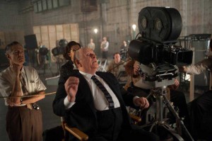
Her favorite creation was the Psycho set. It was also a great challenge because no color photographs of the original set could be found. But Becker’s loyalty to authenticity prevailed and she found a creative way around the lack of information. To determine the colors of the set she referred to the contrasts in the grayscale. “You have a grayscale, which is a gradation of grays up until black and I looked at the stills of Psycho in black and white and compared them to the grayscale,” Becker said. “I picked colors and photographed them in black and white and saw how they translated onto the grayscale and picked colors from that that would reproduce the way they did in [the original Psycho stills]. But once I did that, I picked kind of lurid and unusual colors because I know that that’s how sets could be done for black-and-white movies just because they read a certain way, or because of paint left over. I wanted that world to look a little different from what we expected it to look like.” The result is a polished composite of many sets that ingeniously draw you into the world of Hitchcock and his story.


