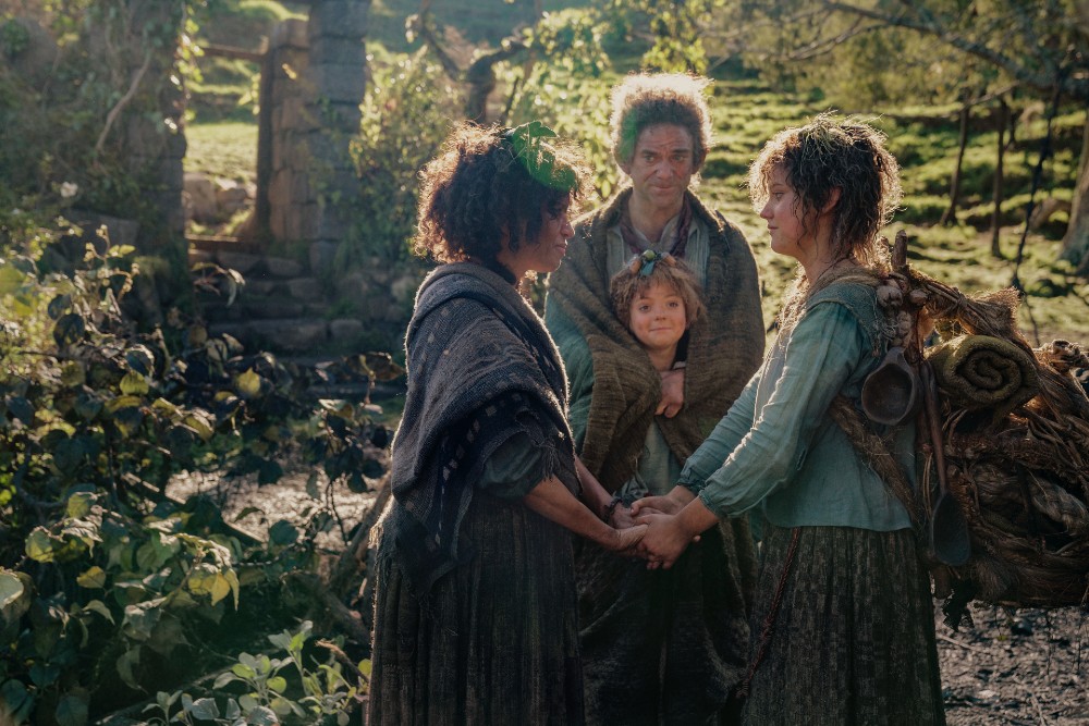
The new Apple TV+ series Hello Tomorrow! may be set in the future with cars that hover, holograms that deliver messages, and robots — aka “bots” — that function as everything from bartenders to housekeepers, but the televisions and video phones, aka “ViddiCons,” are in black and white, and the cars are sporting shark fins, harkening back to the 1950s.
Billy Crudup stars as a charismatic salesman who highly motivates his band of loyal staffers to push the promise of a better tomorrow, selling timeshares on the moon. The rest of the talented ensemble includes Alison Pill, Jacki Weaver, Hank Azaria, Matthew Maher, Nicholas Podany, Dewshane Williams, Haneefah Wood, and Dagmara Dominczyk.
Helping to put an old-fashioned spin on the future was Production Designer Maya Sigel (We Are Your Friends, To The Bone, The Girlfriend Experience), who began her creative career as an intern for Richard Linklater on the film Boyhood, where she had the unique opportunity to “do anything on set.” She gravitated to the art department, where she found her calling in the business and realized that it takes a village to make a movie.
Over the years, she applied that spirit of collaboration as a Production Designer, and quickly became known for her attention to color, objects, and environments. All this expertise made her the ideal choice for Hello Tomorrow!, which required a mix of futuristic set designs grounded in the familiar styles of the 1950s accented with colorful curves and angles. At first glance, the production mash-up may look like The Jetsons crossed with Leave It To Beaver, but Sigel’s references were much broader and deeper, delving into the images and archival footage of the time.
Below the Line spoke with Maya Sigel via Zoom video, where the screen-share feature came in handy as she talked about the inspiration behind select sets and their color palettes and shapes — namely the interiors of The Vista Motor Lodge, and exteriors featuring the moon, which is seen as an alternative destination for the buyers on Earth. She also revealed what went into designing the gadgets, robots, and floating cars, and discussed the designs being a collaborative effort between the graphics, props, scenic design, and VFX departments, as some designs were custom-built while others were tweaked to fit the world of Hello Tomorrow!
Below the Line: Take me back to the beginning. How did you get involved?
Maya Sigel: So, I first heard about the project from Jonathan Entwistle, who directed the first four episodes and is an Executive Producer on the show. We had previously collaborated on the Netflix series I Am Not Okay With This. He told me the premise of this show, and it seemed really exciting. Then, a little while later, I got the pilot episode, and I just loved it. And then I met with the creators, Amit Bhalla and Lucas Jansen, the showrunners, and the other executive producers, and we really hit it off. That’s how I was brought into the project.
BTL: Whose idea was it to mash up the future with the ’50s? How did that come about?
Sigel: That was in the scripts. Lucas and [producer] Ryan Kalil have been developing the show for years. So, thinking about this world, that premise was really baked in and was a big part of the show. Of course, it explores a lot of themes that are contemporary and relevant today, but it’s set in this retro-futuristic world.
BTL: I would say it’s The Jetsons meets Leave It To Beaver in terms of its production design.
Sigel: You know, I read it, and the truth is that a lot of the references that I was inspired by were not shows or films necessarily, but I really went back to the source material, which I usually try to do, especially with a period piece. So it was looking at photographs and archival materials and some video footage of the time and catalogs and all those sorts of things [including] decorating books. That was a little bit more inspirational for me. But of course, The Jetsons is so fun, and I grew up watching it all the time. So all of those references are baked into you as a person, so you can’t help but think about them.
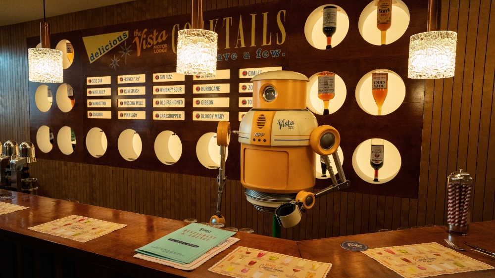
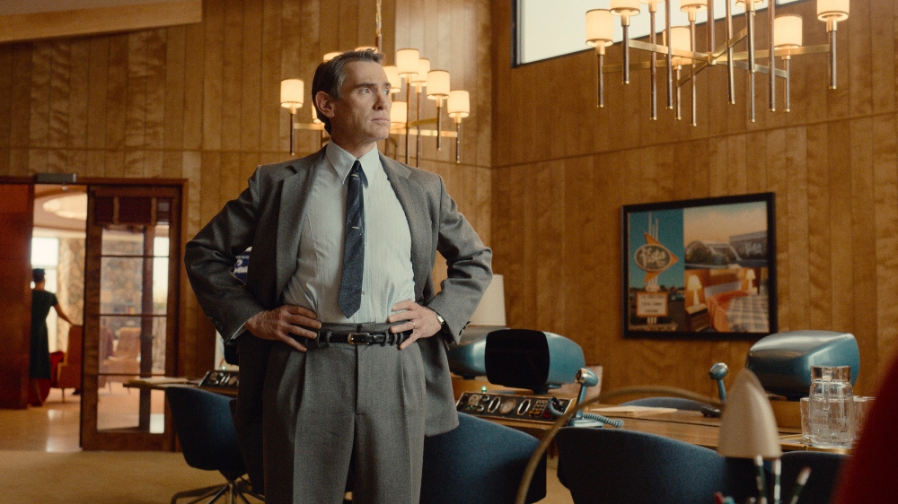
BTL: With the help of screen-share, let’s talk about some of the specific designs for the sets and the inspiration behind them. Let’s start with the Vista Motor Lodge bar.
Sigel: For this design, Amit and Lucas had talked about wanting to put an Automat somewhere in the show, and I thought that inside the Vista Motor Lodge in the bar would be a perfect place for it. It would be fun to have the bar, one of our bots as the bartender, and all the cocktail names with buttons and everything displayed in a little bit of a futuristic way. This piece was custom-made, and it was really a collaboration between construction and our scenic team, who hand-painted all of the lettering on the bar. You can see all of our fun graphics, too. Our Graphic Designer was really great at finding research and then kind of giving it our own little twist. We had a lot to [do to] fill up the world and make it feel real, so you need the menus, the coasters, and the placemats. I wanted placemats for the bar with cocktail menus, and then we had different placemats for inside the diner.
BTL: You are known for bringing lots of color into your designs. Describe the color palette of the show.
Sigel: My idea for the color palette of The Vista, and really the whole world conceptually, at the very beginning, was to kind of separate it into two palettes where you have the Earth and the moon. The Vista is kind of linking the two, so everything in Vistaville is earth tones. It’s kind of an autumnal palette, and I wanted to use a lot of natural materials. In the bar photo, these are warm woods. There’s a lot of river rock in the interior and exterior of the motor lodge, and then the moon is a little bit cooler. The materials are man-made. We have aluminum and metals, and there’s a lot more glass, and the color is cooler. It’s blue. Bringing these together, the colors of the Vista I chose were blue and orange, so you can kind of see that throughout the hotel.
BTL: What about the way the lines were designed architecturally?
Sigel: It’s sort of organized design-wise, where everything in Vista is sort of straight. Things are boxier. Then everything is sort of in the future or on the moon; you get into curves and circles, and everything is, like, a little bit more streamlined and aerodynamic. You can see in the bar the circular elements that are holding the bottles with the plexiglass and lighting them up from behind. The bot is very round as well.
BTL: Was the bot your design or another department’s design?
Sigel: It was a collaboration. I had an amazing Prop Master [Eric Cheripka]. The bot was really something. We had a concept artist who came in really early on, and there was also a bot that they had made for the showrunners and EPs for a previous proof of concept kind of thing for the show. We all really liked that and then kind of went forward with that design. It was built by a company that I’ve worked with before called Jet Sets.
BTL: Was the robot given a name during the show, and where is the bot now?
Sigel: We called it the “Base Bot.” There are different bots. There’s the “Valet Bot” and the “Bar Bot,” depending on what the bot basically does. We knew we would be able to have this one bot body, and then we would kind of change the graphics and the colors of the bot depending on where it was going to be in the world. The bot is in storage. [laughs] It’s actually pretty big. The great thing is that they engineered it so that when the head moves, the light turns on and off. When the body moves, the cavity opens. All of these things really worked. Then there were puppeteers to move the bot.
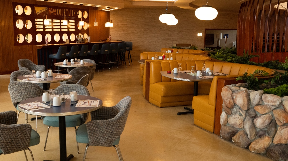
BTL: Cool. The next set I’d like to discuss is the lobby with the dining area in the Vista Motor Lodge.
Sigel: I started designing this set when I only had the first script. I kept asking the showrunners, ‘What do you guys think we’re going to need in the future?’ and ‘What spaces and what scenes might take place?’ It really had to be a spot that had a lot of different areas where action could take place. I wanted it to be as open as possible and have as much depth as possible, but also have these different kinds of spaces where private conversations and things could happen. So there is a different level, a couple of steps up on a platform, the diner, and [the] bar section.
In the center, we have this rotunda, and that was something I knew I wanted to do. There was a reference photo that I had of an old hotel that just had this circular lighting fixture in the center that I loved, and I felt like it would be great because it kind of lit the space. It also feels a little bit futuristic, and it kind of goes with the theme of the circles. There’s a seating area, and it would be good for the pitch sessions and all kinds of things. We built those wooden dividers that are between the “futons”,” as we call them. It kind of feels a little bit spaceship-like too. The interior, the lobby with the conference room and the bar, the diner, and then the hallway and the motel rooms were all built on stage.
BTL: Especially these nooks. I had a nook like this in the kitchen of my childhood home!
Sigel: Yeah. Before I left L.A. for New York, I went on a scout in L.A. for my own research purposes of some of the most iconic Googie diners in the city. (Googie architecture features upswept roofs, atomic imagery, neon, glass, and steel.) This informed the design of the Vista Motor Lodge Diner and Bar. When I was there I felt the dimensions of the space and looked at the materials and things, so that was fresh in my mind to kind of put it together. The banquettes are all in a semicircle. I wanted to do that.
Our Set Decorator had those custom-built and upholstered for us. Our scenic team sculpted all of that river rock because it was never going to be cost-effective to ship that in. I don’t even know where you can get them anymore. There are the planter beds, which I wanted to do there. All of the plants are artificial, so that was part of the reason we don’t have a lot of nature in this world. There’s a lot of artificiality in the food. So I wanted that to reflect in the plants as well.
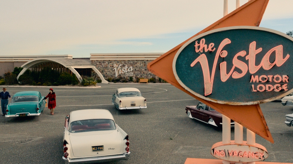
BTL: Discuss the exterior of the Vista Motor Lodge with this crazy sign and all the hover cars in the parking lot with those cool sharkfin designs from the ’50s.
Sigel: The exterior is a location that we modified. The sign is great. We built that as well, looking at a bunch of old motel signs from the era and putting them together to fit into our design. The creators, Amit and Lucas, had in the script that they were hover cars. They didn’t want to go full Jetsons, where things were flying through the air. I think it helps ground the show in reality. I feel like the whole show is grounded, and then there’s like that little extra element on top of it. At first, I thought, maybe we would be able to build a couple of cars, but then it became really apparent that with our timeframe and budget, that was going to be nearly impossible. So we decided we’re going to use vintage cars, and how do we modify them to make them look like they’re interesting and that they hover?
We had this consultant who kind of refurbishes vintage cars. He came up with the idea of kind of covering half of the wheels with chrome hover caps. When that was being workshopped, my scenic team sculpted and painted them. They were custom-fit for all of our hero vehicles (the principal cars from which others were modeled). Then there were a bunch of extra ones for the background. Lotta (Charlotte Forssman), our VFX Supervisor, painted out the bottom of the wheels. I think it worked really well. With Eric, our Prop Master, I was always like, ‘Try to find the most interesting cars we can from the era.’ There were so many beautiful designs. I was really happy with how the cars came out. I picked the colors, and the hero ones were repainted and reupholstered.
BTL: What was your color scheme with the cars?
Sigel: So it had to fit within the world as well. Jack’s (Crudup) car is emerald green, and for me, that just felt like his car needed to be the most classic and a car for a successful family man. Using that deep green also just felt like wealth because that’s what he wants to project.
The “APP HoverVan,” was a really fun one. APP is the company that makes all of the gadgets and hover vehicles in our world. As a reference, we would look for these European delivery vans instead of using American ones because a lot of them were much boxier and bigger, like these milk trucks. If you think of FedEx or UPS trucks, they’re kind of huge and boxy. I thought it would be nice to have something that was a little bit more curvy and kind of friendly-looking because that’s what APP wants to sell itself as.
Teal was the color I chose for APP, It’s kind of in between the blue of the moon and the green of the earth. I’ve used different colors with the gadgets, but a lot of them are teal as well, like the ViddiCon (telephone) machines, which are painted in a muted teal.
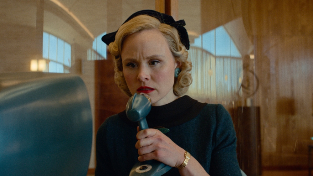
BTL: Talk about the design for the ViddiCon, this world’s version of a telephone.
Sigel: The ViddiCon is basically like a version of FaceTime, but it had to be a bit clunkier. So I thought we’d use a screen that feels like a TV screen of the era, but kind of the most streamlined version of that. While designing it, I also had to think practically about how they needed to be used in a bunch of different spaces. So they’re in the conference room. I put booths in the lobby of the hotel, and people have them in each hotel room and then also in their homes. So they were going to have to be portable and used everywhere.
I worked with one of my Art Directors, Joe Comeau, who’s also a Concept Artist, and we kind of riffed on a bunch of different ideas and came up with having them on this wooden base so that they could be portable. The exterior microphone was just an idea I had. I thought it would be fun to have something that had some weight to it that the actors could hold and play with and had that kind of wire connected to it so that it just felt a little bit more retro than if it were wireless.
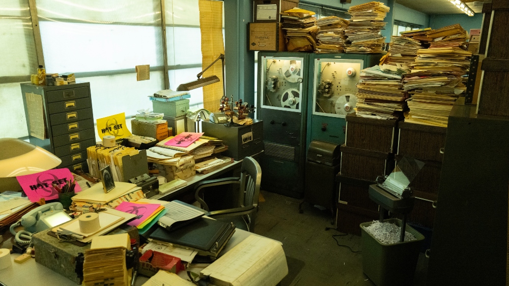
BTL: What inspired the office design for Lester Costopoulos (Matthew Maher), which is less futuristic?
Sigel: [laughs] Funny, this photo has hot-set papers all over it! It’s something that the props team puts out for the Set Dresser so that people don’t put coffee cups or water bottles on the set. So the idea with Costopoulos’ office is that it’s this old-school bureaucratic place and that he is a paper pusher who is by the book but just completely overwhelmed with work.
The biggest note was to just make sure there were stacks and stacks of files. Set Decorator George Detitta and his team did an incredible job with this office. This world is about paper, and there’s not as much tech. The other thing that George did that was fun was that every desk had these old rotary telephones with the plexiglass, like a little nod to the past.
BTL: Would you say this project was the most fun you’ve had designing?
Sigel: [laughs] Well, I feel like you can’t say that because you love all your children equally and all my projects equally. It was really fun. I’ve always loved this era, and so that made it really fun. It was great to just be able to get into the research on this and keep going with the research throughout the whole process of making the show. It’s so wonderful to have the opportunity to do something that’s from the past but also has this twist, and you can take creative license. I didn’t feel bound by any rules, really.
The showrunners and the directors really put a lot of trust in me and my team. I really felt like we had the space to be super creative and inventive and just kind of throw ideas in. Everybody brought in great ideas for this project. They would be like, ‘I brought in this book that I found in my basement,’ or ‘Here’s this documentary that I saw over the weekend.’ It was so nice to be doing something where my entire department was just thrilled to be on it. I feel like everybody was just a little bit more invested than usual because they were so excited to be building this world.
Season 1 of Hello Tomorrow! will wrap up on Friday, April 7 on Apple TV+.


