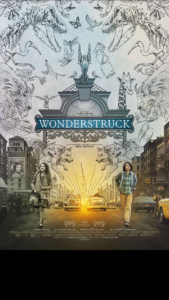
Sandy Powell wore two hats for Wonderstruck, the cinematic telling of the Brian Selznick book, that tells two simultaneous stories about Ben, a young Midwestern boy in the 1970’s, and Rose, a young girl in 1920’s who both run away to New York City. Because Powell helped get the project going, she is given credit as executive producer as well as her usual credit as costume designer.
Powell became friends with Selznick after meeting him on the set of Hugo, adapted from the author’s book, The Invention of Hugo Cabret. As a guest at his house, she picked up Wonderstruck off a bookshelf. “I read it in one go,” shared Powell. “I said, jokingly, ‘I’ll be your producer. We’ll find a director.’”
Since Wonderstruck is a very visual book with 50% illustrations, Powell thought of Todd Haynes because he is a director with “particularly specific visual interpretations of everything.” She was interested in seeing his take on a film for a younger audience. Powell worked with Haynes on Carol, but knew she had to wait to show him the book until he completed editing. When he finished the film, he read the story immediately, responding that he loved it and would like to do it. In terms of the costume design aspect of Powell’s contributions on the project, the story structure makes the job like doing two films. “The only way to get your head around it was to treat it as if it’s two films. The workroom was divided into two. There was the seventies side and the twenties side, with all the extras costumes,” Powell revealed.
The design concept was clear from the start, already having the book of origin and the screenplay, which are about real people in a real world. The concept as written had everything in the 20’s in black and white, and with the idea of silent movies in mind, only had music as the audio; everything in the 70’s was in color, with sound and dialog and had the look of films made during that period.
In designing for the black and white shoot, Powell was not able to convey emotion through the use of color. Textures and patterns became more important in the costumes for those sequences of the film.
“That was the most interesting challenge for me, because I had to unlearn everything and work in a completely different way,” noted Powell. “I love working with color. I usually start with color in a very instinctual way. I will have ideas of characters in terms of color before I know what they actually are going to wear.”
Powell started the process by trying original clothes from each period on the actors. This helped her narrow down what shapes looked good on the different performers. The clothes had to work on the actor’s body, not as the actor, but as the character. When she finally gots it right, that’s when she saw the character coming to life.
 For the twenties clothing, Powell would put together an outfit, photograph it, then look at it in black and white. She realized that what looked good to her esthetically in color, did not necessarily look good in black and white. Often clothes appeared bland, because colors that complimented each other were very similar tonally with the result being the “same bland shade of grey.” She had to strive for more contrast and texture in the fabrics that she chose.
Powell had to take a different approach to the clothing for the seventies. What works well in black and white, like florals, does not work in color.
“It looks messy, especially when it’s moving,” said Powell. “I tend to avoid florid patterns in color unless that’s the purpose of it to look messy. A fabulous dress with a pattern that looks really nice in person, when you have a photograph taken, you suddenly can’t see the shape. The pattern disguises the silhouette. It’s quite interesting how the reverse works in black and white than it does in color.”
In this particular project, Powell could not use actual period clothing, because working with children, she needed multiple replica outfits for both actors and their acting doubles. Additional outfits were also needed because during several months of production, children can grow.
“Suddenly the clothes don’t fit anymore,” laughed Powell. “Shoes. Feet grow overnight. Especially boys, they can grow a size overnight. It’s really weird.”
The principal cast was fairly easy to dress because they had limited costume changes. Most of Powell’s efforts went into the background players. The backgrounds were more important than usual because they were providing a backdrop, helping to create the world that these children find themselves in. And it wasn’t just getting the clothes right. It was getting the people right. Powell worked closely with the extra casting director because it was important to find the right faces, shapes and body types appropriate for each respective time period.
“That’s what the children are reacting to. They turn up in New York City. Of course, there’s buildings, and the enormity of it, but more than anything, there are crowds,” explained Powell. “It really took up a huge amount of time and effort getting that right. My favorite scenes are the street scenes. I’m really proud of that.”


