David Fincher’s Mank focuses on screenwriter Herman Mankiewicz as he puts the final touches on the script for Citizen Kane. The action, set in 1930s Hollywood, features luminaries from Irving Thalberg, William Randolph Hearts, and, of course, Orson Welles. Mank’s plot, however, it focuses on Gary Oldman as the principal character and on a magnetic performance by Amanda Seyfried as screen legend Marion Davies.
Given the setting—Hollywood on Hollywood—it is no wonder that Mank, in addition to an impressive cast, boasts production values that are also showy, including a Golden Globe-nominated soundtrack by Trent Reznor and Atticus Ross (who won an Oscar for the previous Fincher collaboration, The Social Network), and black and white cinematography by Erik Messerschmidt.
The lack of color makes sense and is effective in recreating the mood and style that most viewers’ minds have of that era. But it is not without its own set of challenges. In particular, how could a designer draw up costumes and clothing for the characters to convey the high echelons of Hollywood history some of Mank’s characters occupy, while working within the black and white environment? To find out, Below the Line News spoke to Mank’s costume designer Trish Summerville, whose work is as notable and as colorful as The Hunger Games: Catching Fire and Gone Girl, about working in black and white for the first time.

Below the Line: You have a relationship with Mank director David Fincher, but what was your reaction when you were told about this project?
Trish Summerville: Well, with Dave he is one of those directors you hope you get the call to come back for another project. It’s a whole concept for me. I’ve done commercials or videos but not a full film in black and white, and this was actually a bonus for me. I always joke that you hope you get a good script, a good director, and something interesting costume-wise and for this it hit all that and then some.
BTL: How did you approach something fully in B&W?
Summerville: You may think it’s easier, but it’s actually more challenging. In addition to the usual design process, we had to figure out what would be pleasing to the naked eye on set, but also translate that to what it would look like on the screen. You can’t go too dark you can’t go too light, you can’t strictly use black and white because it’s too high of a contrast. You have to figure out what you can use in terms of patterns and textures so that things don’t pop too much or disappear.
So we pulled out clothing from racks and had to photograph it with our camera on your phone to see how it would look and that way we would remove what popped too much. We had the same process for fabrics, for men’s suiting. The phone helped us figure out what worked. We did that with hats and jewelry, with all the buttons. Then we figured out what the palette could be so that you had tones and not everything looked the same.
BTL: How did you decide what you wanted the known characters to look like?
Summerville: The research—which is what I love about our jobs—focused on the Academy’s historical stuff and the books that we had. We picked and chose photographs behind the scenes and in their homes in their real lives. We had a research board for each character and then kicking in pieces that fit into the timeline we had.
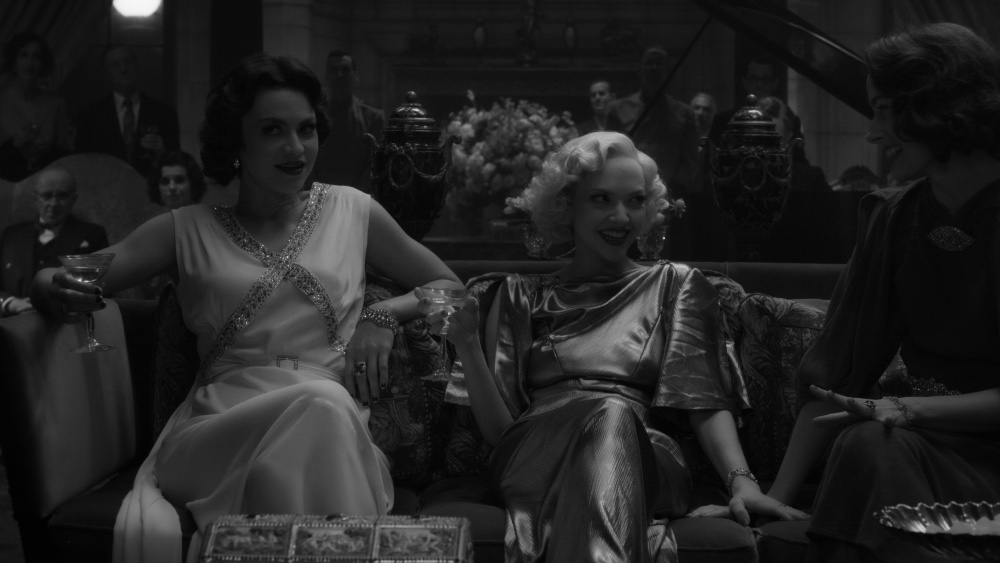
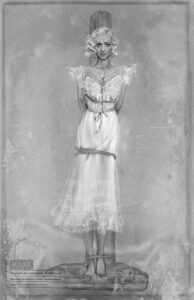
For example Marion Davies, we had a lot of photographs for her. We knew we had to hit some scenes like the Circus Party, Mayer’s birthday party, her exit from MGM, and the picnic with Mank. For the exit, for example, we had a photograph of just her standing by a car, wrapped up in this coat, with this fur and a cloak hat. I wanted to keep her imagery light because that is her character, she is playful. I used metallic colors—I wanted your eyes to go towards her because she is one of the prominent women in the movies and I wanted the light around her to draw you to her.
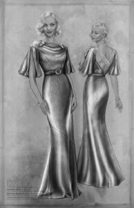
BTL: Tell us more about the colors you used to dress Amanda for playing Davies?
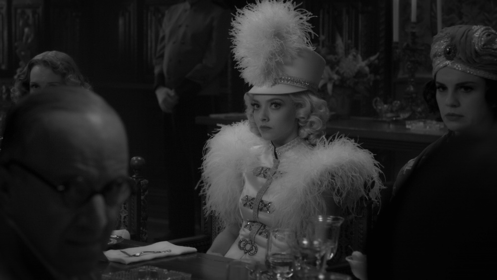
Summerville: At the Hearst party, the Circus Party, she is in eggshell, kind of off-white. The overall silhouette of that costume is very true to what she actually wore. When she goes to the picnic with Mank, she’s in a black and white chiffon dress — it keeps her light and airy both in the color and fabric. For the Mayer birthday party, I wanted her in lamé, and I found this fabric that was like an antique gold lame. The most color she has is when she is leaving MGM, and that is a very light powder kind of blue coat, that translated into a very light grey, and she also a silver mint coat.
She is in a lot of scenes with a lot of men. I wanted her to be in light colors and fabrics as compared to them.
BTL: The contrast especially to Mank, who is very messy, is stark, and men were always in suits. How did you approach the suit issue?
Summerville: Our clothes in our society changed in the 1960s when washable clothing, knits, came into your daily life. Prior to that, you had more limited amount of options. Men had two suits, three suits depending on your income level, and you changed your shirt and your tie.
With Mank, it was about all the photos as well, including Bar Mitzvah photos of him with his family. It was fascinating and we wanted to stand out that he was this really interesting character that he really didn’t care what people thought of him. People were drawn to him because of his wit and his brain. He drank a lot, he gambled, he was a bit of a mess. But his wife Sara got him ready to go out properly dressed but as the day progressed and he sweated alcohol out of his body and gambled, his look deteriorates. His shirt becomes wrinkled, his tie and shirt are not properly done up. Outside of weddings or funerals, he had a very “lived in” authentic look.
We would put things in his suit pockets like cigarettes or matches, to give Gary [Oldman] something more authentic, and he was very interested in that sort of stuff. With him it was a joy to have a rumpled character that was staggering around drunk all the time.
BTL: Tell us more about how you went about achieving different looks for the many men in suits?
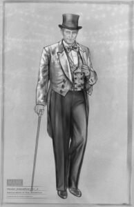
Summerville: Thank you for noticing and recognizing that. With a contemporary film you have so many more fashion options for men than with period films—there are guidelines in place basically and you have less place to where you can go. We also had boards of each time there were more than three men in the room, so we could see what ties and what shoes and everything else. For example the writers’ room or the Mayer birthday party. You had to figure out which fabrication we were going to make each suit and shirt out of so that the tone could be different. We had pinstripes, you had glen plaids, you had herringbones, you had hounds’ tooth, just so that we could change up each room and scene.
It was also figuring out things about each character. For example Thalberg was world traveled, he was rich, and he was young. So his suits were more of the time, more fashionable. When you look at someone like a Hearst, even though he’s wealthy, he’s traditional and older. So they lean more to a late 20s silhouette and cut. Longer jackets. He is the only one with a pocket watch to give him a different kind of feel.
BTL: What about the look for Orson Welles, how did you decide on that?
Summerville: Our movie was not about Citizen Kane. It was about Mank. When I looked at what I wanted him to look like, I looked at photographs and stills of what he wore while he was directing the movie, as opposed to acting in it.
BTL: How did the different members of the cast and the director react to the ideas you were showing?
Summerville: It started with showing Dave the boards, and it focused a lot of the men because of all the male leads with more or less the same statures. We had boards for each man with details about what watches and even shoes they would wear. Having those conversations and hearing his needs for the overall look was iterative was helpful. Then we had actors come in for fittings for suits that were not complete yet but you had the actual fabrics.
What worked really well for this was that most of the actors were reading books on their characters. They could come in and you could see them slowly transform into the characters. The actors would show up in sweatpants or jeans and a t-shirts. As you are dressing them, you make them all proper and tucked in, and you see them transform.
Everyone was very open to coming in to try whatever we had and seeing it, and there were very few changes made at all. Even Amanda and Lily [Collins, who plays Mank’s secretary, Rita Alexander] were very happy with what their costumes were and didn’t want to make many changes because we could show them based on the research why we were leaning towards certain shades or fabrics.
BTL: What work can we look forward from you in the future?
Summerville: I’ve already gone in my head through all the concepts I’d like to use for the Hunger Games prequel, and I’m currently working with Catching Fire director Francis Lawrence, so here’s hoping [laughter]
Mank is now available via streaming on Netflix.
All pictures courtesy of Netflix, except where noted. All sketches by and courtesy Trish Summerville. Click on all photos for larger versions.

