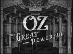
Hollywood-based design/production studio yU+co created the imaginative main title and end title sequences for the new Sam Raimi film Oz the Great and Powerful. The goal was to embrace the idea of illusion that plays a central role in the story, and pay homage to the history of cinema.
“The opening sequence is aimed at kids, so we chose to use classic imagery that would resonate with them – a magician, monkeys, a circus elephant in a tutu, acrobats and witches,” said yU+co director Garson Yu. “We created a 3D wonderland with visuals drawn from the imaginative world Sam created, but reinterpreted them so as not to simply mimic the story. We want to prime the audience for the adventure, but not give it away.”
Yu teased the audience with a concept that pays homage to the idea of illusion and history of cinema, specifically the techniques and styles found in silent movies from filmmakers like Georges Melies, perhaps best known for his groundbreaking A Trip To The Moon. Yu also took inspiration from the German documentary Film Before Film, which chronicles the history of cinema’s precursors and gives a tour of the visual tricks and mechanical illusions that entertained audiences from the 17th to the 20th century.
“We wanted to create a tone that was magical – a surreal voyage that used traditional techniques of physical special effects to expose the trickery behind the magic,” Yu explained. “The sequence intentionally shows wires connected to floating bubbles and sticks attached to the levitated objects and typography.”
For Yu and the creative team, it was essential to convey a sense of naivety in the opening sequence, something that would evoke small-town theaters where stagehands hold sticks attached to cardboard artwork offstage and painted backdrops drop and slide around the set.
“We wanted the art work to look authentic and have a hand-painted quality to it, so all of the individual elements were created with that in mind,” said Yu. “Everything has a sense of physical reality and gravity to it – objects don’t float or fly in – they are always supported by something tangible. Plus, all of the imagery makes reference to the story and the character. Our typography was inspired by look of early circus posters and silent film titles.”
Opening on the twinkling stars of the Disney logo, the sequence begins as the camera pulls back to reveal we are watching the titles through a 3D diorama – a paper theater. To the delicate music box inspired score by Danny Elfman, the camera pushes through the diorama set as titles move in concert with ever-changing Oz images, such as floating bubbles, flying monkeys, swirling tornado winds and a crystal ball – all of which foreshadow the characters and the story.
yU+co also handled the closing credits for the film, which take their inspiration from the classic line in the original Wizard of Oz: “Pay no attention to the man behind the curtain.” Yu’s team designed the bright, classic-looking “The End” that flashes across the sky and the sequence that follows, which like the beginning opens with curtain, but not on to a paper theater this time.
“The original film The Wizard of Oz is so classic and brilliant, we faced a challenge to meet the high expectations it set,” Yu said. “We saw this project as our way of paying respect to film history. It was a fun challenge to create an exciting, magical journey to enter audiences into the world of Oz The Great and Powerful, and we are honored to be a part of this great film.”


