
“It’s unfortunate that we have to go to Vancouver to shoot movies like this,” said production designer Rick Heinrichs about Big Eyes, his latest collaboration with director Tim Burton. They’ve worked together since Edward Scissorhands, with Heinrichs doing production design for films like Frankenweenie, Dark Shadows and Planet of the Apes, when the he wasn’t busy with a Pirates of the Caribbean installment, or a superhero film along the lines of Hulk or Captain America: The First Avenger.
Heinrichs’ observation doesn’t mean that they didn’t have a good time in Vancouver, or terrific production support in finding, and doubling, locales. But rather, in the primarily ’60s and San Francisco-set story of Big Eyes artist Walter Keane, who took credit for the ironic waif-paintings of the era actually made by his wife Margaret, the city-by-the-Bay is “a character in the film – emblematic of the character and gender roles” that were being redefined in the very era in which the events took place.
Setting was critical and Heinrichs had to “make sure we hit San Francisco,” with some “characteristic elements,” including settings like the Palace of the Legion of Honor, and the beatnik-into-hippie terrain of North Beach.
 But otherwise, the challenge was to make Vancouver settings look like period San Francisco. The film is unusually successful in blending its British Columbia settings with actual San Francisco scenes, and they were able to find “city streets and galleries that worked well for us.” They also had an advance scout in the form of Selwyn Pullan, a Canadian photographer from that same era known for popularizing West Coast modernist architecture.
They “found a fabulous place in the Dunbar-Southlands,” the B.C. neighborhood known for its gardens and trees, where a Pullan-esque house stood in, in several key sequences, for the Bay Area Peninsula home that the Keane family moves into once their big-eyed art takes off.
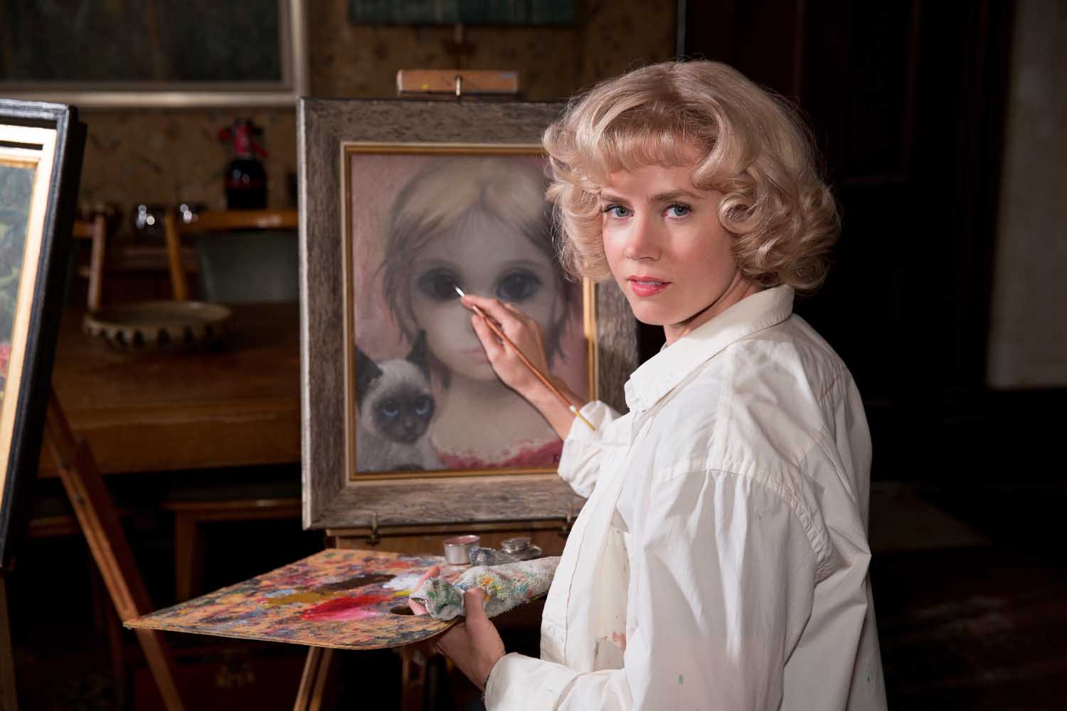
But locales weren’t the only thing that had to be doubled. “We had to create our own artwork for this,” Heinrichs said. The originals, most of them now found in Margaret’s own gallery, were too valuable to spend their day lounging in the hot lights, so in grand Hollywood tradition, stand-ins were created.
“We’d print on canvas,” Henrichs said, taking each of the nearly 200 prints then “going over them with oils and acrylics. And while there may have been stand-ins, or doubles, there were no extras. “There was no way to tell what Tim was going to look closely at,” he recounted, meaning any of the pictures had to be ready for a close-up, so they all had to look convincing, no matter where they would be placed on set.
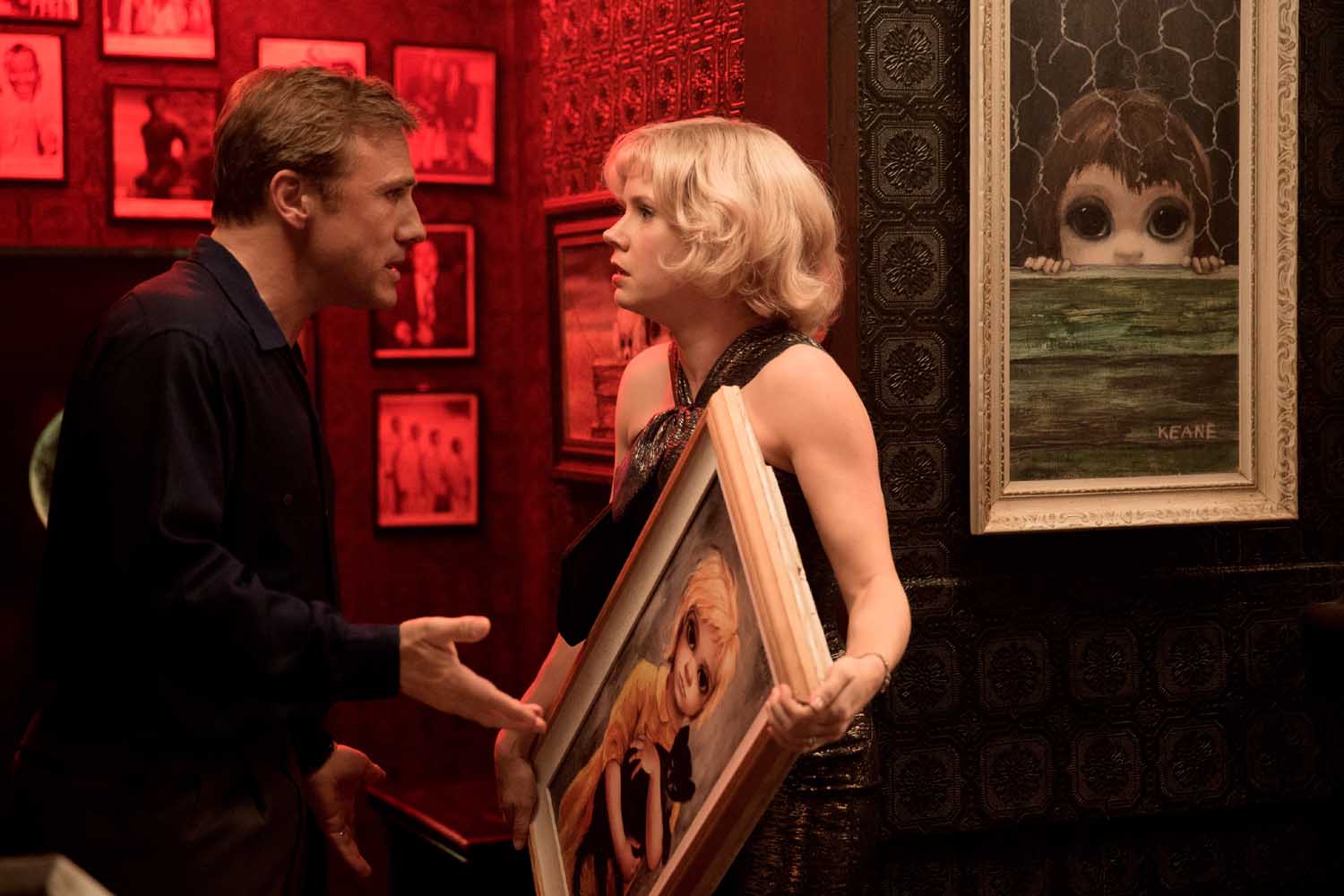 “All the prints are gallery-worthy,” he added, also noting the process taught them even more about Margaret’s techniques, since she “didn’t put a lot of brush on the canvas.” Her technique would change over time, though, so there was also the continuity job of making sure the right paintings were seen in the right years.
All this was complicated by the fact that the film was shot out of sequence. But Heinrichs is quick to credit the continuity people with keeping it all straight, just as he credits his other colleagues.
He starts with the color conversations with DP Bruno Delbonnel, costume designer Colleen Atwood and Burton, each of them “a great collaborator,” and adds that visual effects supervisor Mark Stetson – another long-time collaborator – with giving them “the confidence we could evoke San Francisco in the ’50s and ’60s.”
That confidence extended to not only notching out anachronistic skylines, signs and automobiles, but restoring some of the era’s landscape – for example, North Beach’s famous Black Cat Cafe, once inhabiting a spot where a pizza parlor now resides.
Besides Stetson, he also mentioned matte artist Syd Dutton, who was convinced to belay retirement in order to help create visuals that add up to “all these Little Burton-isms” in the director’s films.
He explained that the director famously “likes to find a sense of reality and push it.” So you have production design choices like an attic where Margaret is consigned to churn out paintings, with an exaggerated claustrophobia, or an early post-war California suburb evoking the one in Scissorhands.
But here, a lot of the “stylization was coming from the work itself,” which is to say, the Margaret Keane’s paintings, and “surreality of the characters” – both on canvas, and the people making and promoting the work. That work is “out there,” he says of the big-eyed children, but the story is about the art movement sparked by them, “whatever one’s feeling about the aesthetic.”
Burton’s aesthetic, however, seems perfectly matched to the material this time, just as so many of his career-long collaborators, like Heinrichs, seem perfectly matched to the director bringing it to the screen.


