Continuing Below the Line’s look at the crafts behind David Fincher’s Mank, we spoke to Production Designer Donald Graham Burt, his sixth go-round with Fincher after the first worked together on 2007’s Zodiac. A year later, Burt would win the Oscar for Production Design for his work on Fincher’s The Curious Case of Benjamin Button. Besides performing those duties for six Fincher films, Burt also played a significant role in the designs for Fincher’s Golden Globe-winning Netflix series, House of Cards.
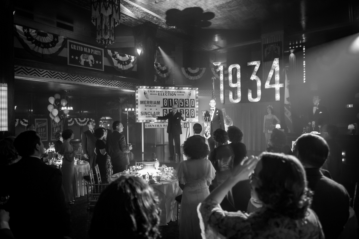
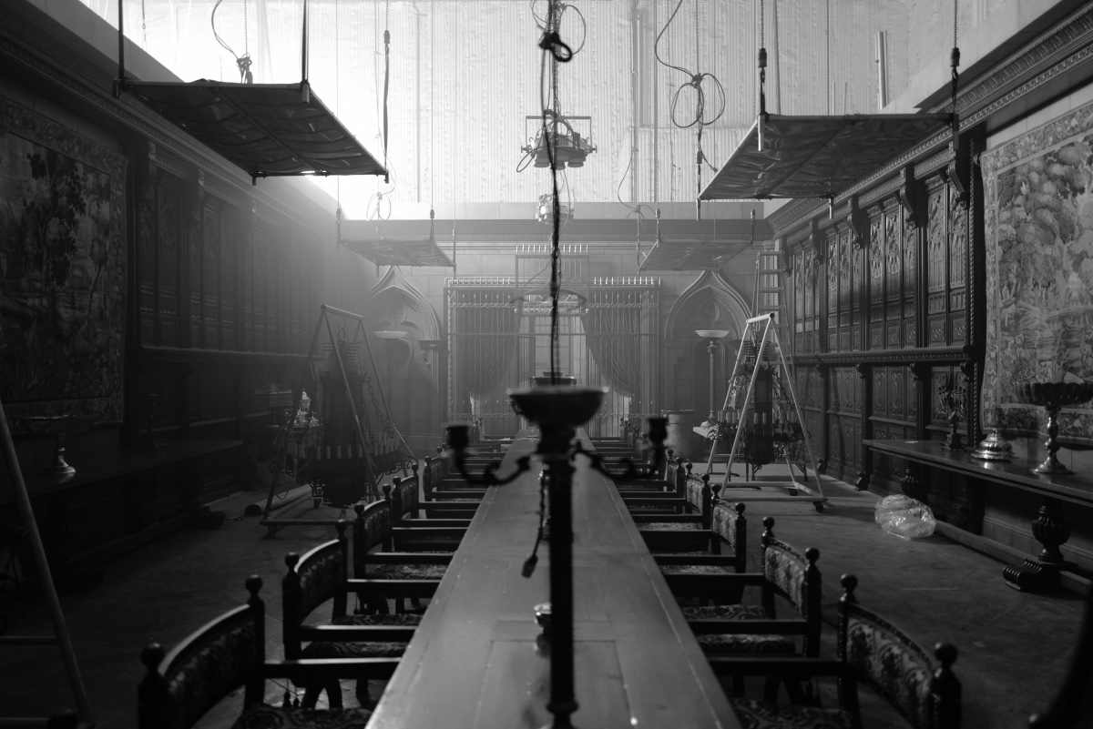
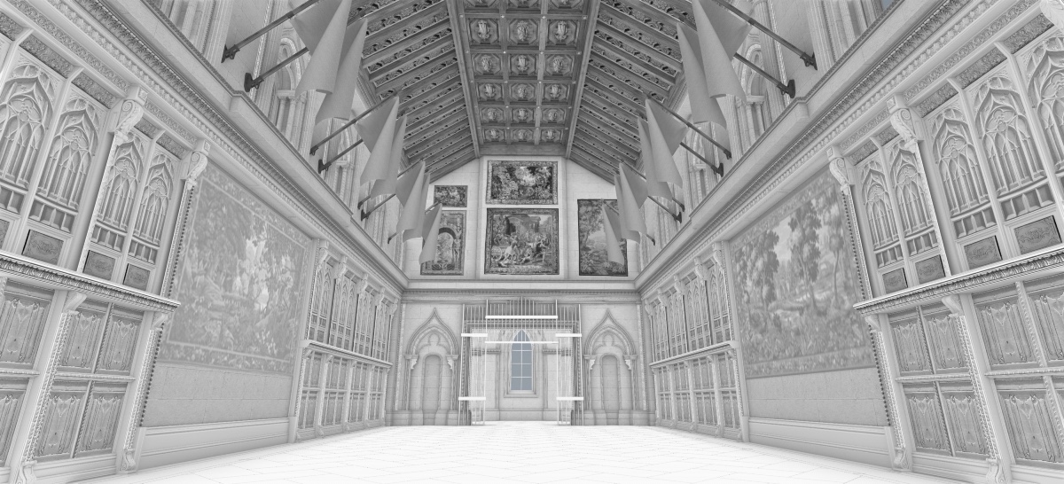
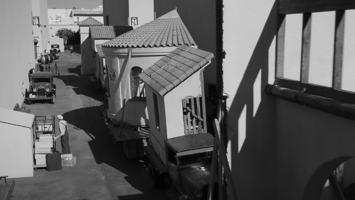
Burt’s definitely a bit of an old school Hollywood vet, going back to some of his work in the ‘90s like The Joy Luck Club and Dangerous Minds. Still, Mank offered Burt a number of new challenges, the first one being the fact that the film would be shot entirely in black and white, the second would be how it would task Burt and his team to recreate some of Hollywood’s most iconic locations from the ‘30s and ‘40s. You only have to watch the movie or look at some of the images below to agree that Burt and his art department came through with flying colors… even without having any actual color.
Below the Line spoke with Burt over the phone for the following interview.
BTL: You’ve worked with David Fincher for a long time, so was this something he’d mentioned to you over the years?
Donald Burt: No, actually, this came up just a few years ago, when we were actually prepping for another project that became postponed. But during that prep, he mentioned it, and that’s the first time I’d heard of it, to be honest with you.
BTL: Did he have a script for you to read at that point, or was it still something he was working on, or something he hadn’t been focusing on?
Burt: As far as I know, he had the script, but we were engaged in the other project, and then when that was postponed, of course, he immediately sent me the script and said, “Okay, this is what we’re doing next.” I know it had been around in the 90s, at least, because when we finally moved forward on it, there were some location photos that they had taken when they did a feasibility study, and it was a box of photos. Actually, it was photos in the old-fashioned way, where they would actually take the photos and paste them up in file folders, as opposed to what we’re so used to now everything being digital. They were all in black and white, and it was interesting to look at those just because so many of the locales, even from then, no longer exist in LA, places like Primo’s Restaurant and the Ambassador Hotel. It seems like Paul Williams’ architecture has been razed, but that’s kind of how it all began.
BTL: I haven’t spent much time in LA myself, so I’m not as familiar with it as people who live there. Although a lot of those places are gone, I feel a lot of Hollywood in the ’30s and ’40s was captured either in film or photographs, so there must have been a lot of reference material and resources to turn to when designing the film?
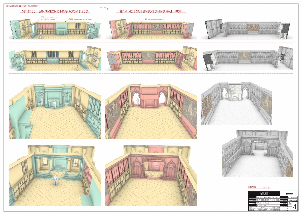
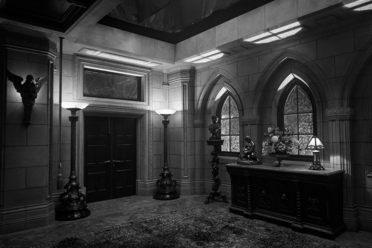
Burt: Oh, absolutely. Even more interesting than that is that I found some really great photographs from the period of the ‘30s of San Simeon, which is now Hearst Castle, but old black and whites that we really relied upon in terms of emulating San Simeon for the film. I was kind of surprised to find all the photos that I did of it. L.A. was so well documented during that period, probably because of the film industry and photography and so forth. There was great research on the city and its development. The Los Angeles City Department of Water and Power has a wonderful archive of historical photos that we relied upon as well.
BTL: Were a lot of these places captured on film as well?
Burt: You mean captured on film in the period? Well, I looked at quite a few films. One that comes to mind is I looked at Sunset Boulevard a few times, just because, it has scenes that took place at Paramount Studios, and we were filming at Paramount. It had the entry gate at Paramount Studios, and the streets around Paramount Studios. It was interesting to see just the transformation of paramount from then to now. Actually, even as I remember Paramount in the ’80s, the main gate to Paramount is now encompassed within the campus. They bought the apron of the street in front of it and made it part of the Paramount Studios. In the day and even into the ‘80s, that was a street — Marathon Street–which ran right in front of Paramount to the main gate. When we were doing that scene where he’s leaving Paramount Studios, we’d shoot it on the backlot of Paramount, but we realized in our research that in actuality, there was a street outside of the studio there instead of it just being what it is now, a fountain and a parking lot.
BTL: Did you actually work at the studio with David on some of the movies he made for Paramount like Benjamin Button or Zodiac?
Burt: Yes, I was part of those films, but I don’t think we shot those at the studio, though. I remember shooting Dragon Tattoo at Paramount, but it wasn’t a Paramount film. It’s kind of strange, sometimes, in LA with a studio. You’ll be doing a studio film, and it’ll actually be easier to get stages at another studio, just because of availability, and so forth.
BTL: At what point do you get together with Trish Summerville, who also has a big job recreating costumes in the black and white? I know [Cinematographer] Erik Messerschmidt did some tests for the camera, so were you involved in that aspect of the preproduction as well?
Burt: Well, I started with David quite a few weeks before the actual official production start date. I think the actual production start date was around 12 weeks out from filming. This was a challenging schedule and a challenging budget, both. This was a smaller film, so to speak. But I started much earlier and spent time with David scouting and talking about the film. Actually, during that four to six weeks was, in my mind, when the film was made, because he’s able to express without the pressures of coming back to the office and having a production meeting or having people ask questions and so forth. He’s able to express freely, and we can discuss kind of where the film is going and what it’s going to be. Within that time period, we kind of set up a template of what it is, and then Erik and Trish – I’m not sure when Erik started, but Trish started, and of course, we got together.
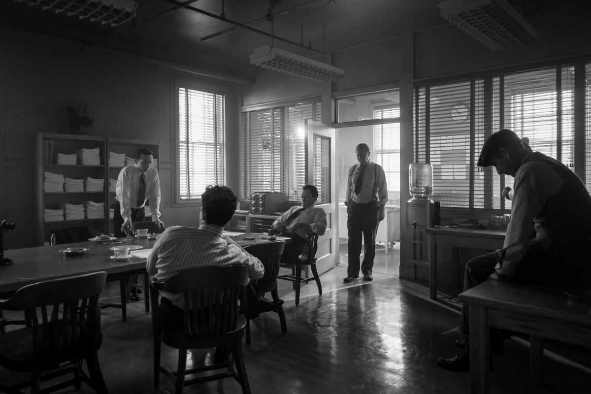
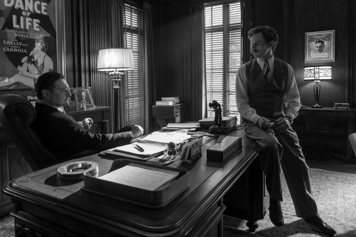
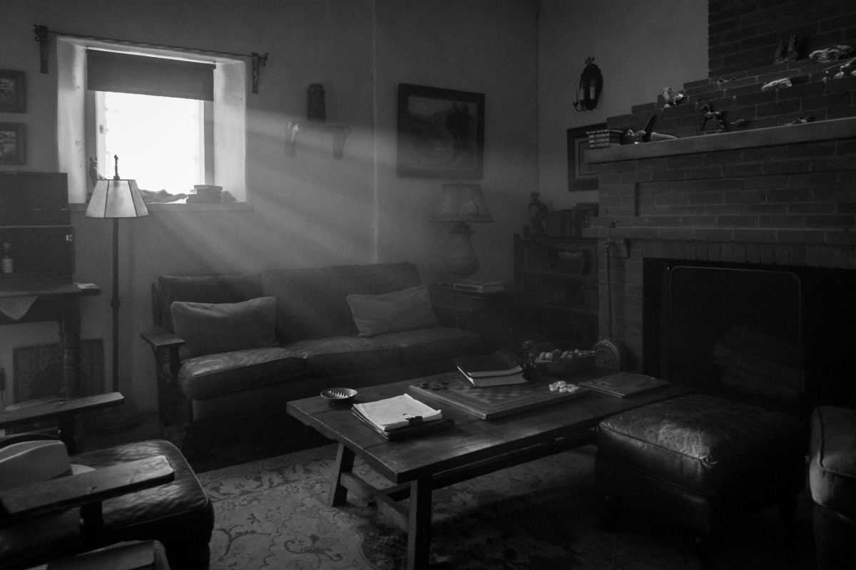
Within my department, I put up all the research, and we go through that, and we make it accessible to her digitally. She was working in a satellite office away from us, so most of our correspondence was via websites and so forth, and links. Pretty early on when she started, we were in touch with each other, and of course, the big issue was how to deal with the black and white – she with costumes, me with sets. With sets, it was a little bit different than the costumes, not completely, but just in the sense that some of the colors that tested really well for black and white and had depth and layer to them weren’t colors that he wanted to paint his set. We had to find colors and values that photographed really well in black and white, and yet at the same time for a set, didn’t make it cartoonish or carnival-ish. We kept it within the realm of reality, because we know we needed actors to come in there and act out dramatic scenes. For instance, we didn’t want to paint San Simeon in greens and violets just because they photograph nicely. We wanted to have an atmosphere that felt real. So we did quite a bit of testing with grays, warm grays, neutrals, browns, and so forth, just to be able to do that.
BTL: I think one of the people I spoke to mentioned that the bathrooms at Paramount Studios were a very specific shade of green tile that everyone knows and that you spent a long time finding the right color that would translate to black and white.
Burt: Exactly. We went through quite a few photo sessions of testing colors and different greens on that. Of course, we couldn’t find the tile, so we just ended up painting it with tile paint to get the tone and the color that we wanted. It was kind of challenging, but David did a brilliant thing at one point during prep, and that is he had everybody document any elements that they wanted for the set in the “Noir” filter of the iPhone. He sort of standardized things and that helped immensely with everybody — set dressing, props, picture vehicles, special effects with whatever they were doing, and myself with the sets, as well as Trish with costumes I think. All of a sudden, we’re all looking through the same lens, same filter, and as the film progressed, it was interesting that, especially props and set dressing, I noticed they began to become intuitive toward what would work and what wouldn’t. It was nice to get to that point where it was second nature. It wasn’t like we had to bring everything in and test it all. We were able to go out, take some pictures… I found the perfect chairs, but they were covered in red, and I couldn’t use them, because they would look black. I didn’t even bother picturing them or taking a photograph. To get to that point was important, I think, to where subconsciously, we were able to react to things without having to do the translation.
BTL: Did you feel that you had to exaggerate colors or pull back on the color for the translation to work? Was there a specific amount of percentage to add or remove to make it work well?
Burt: I didn’t really approach it mathematically, to be honest with you, and I know in the ‘20s and ‘30s with sets, they’d come up with these grey scales that were sort of these mathematical computations of color and value and so forth. In the early days, they relied so much upon using mustards and violets and stuff, and then they started developing grey scales and brown scales for it to get into the neutral zone, as I was speaking of earlier. But I didn’t really do that. I just sort of found a range of colors that worked for us, and we knew that if we stepped off of it a little by darkening it or by lightening it, it would fall a certain way. We stayed within the realm of colors that seemed to work for us for the sets. We didn’t really exaggerate anything too much. We tried to keep it real, and we would photograph the painting of sets as we went along, just to make sure that they were all working out.
BTL: I was really fascinated by how they used matte painting in post vs. having the paintings at the back of the set to create the background. How much of that were you able to work on or determine beforehand or did you just have to stay involved in post to make sure it matched up?
Burt: We did illustrations of some scenes and some sets within scenes where we felt like there needed to be set extensions or some work or something. By the time they get to that in post, after they have the edit, we try to illustrate to give them a direction, and we realized that they take that and they enhance it and make it better. I’m quite in awe of what they do. We just try to say, “This is what we’re thinking. This is the direction to go, a point of departure,” then they usually take it and make it 10,000 times better. There were other things where they’d shoot a scene, and they’ll need to add a building or something on the street for a certain shot that’s not anticipated and so forth. I think what happens is that we create a bank of research for architecture, street scenes and so forth, and that’s something they can access and reference to, and we kind of keep it specific within, “This is the direction of where we want to be.
BTL: Erik mentioned that you had finished the shoot before the COVID shutdown, but did you still have to do stuff remotely after that point?
Burt: No, they finished physical photography, actually, right about now I think or a week later, right when they did the shutdown. They would reach out to me from time to time and say, “Is there a file on this or a file on that?” or what have you, but one of the things that we do as an art department is we organize things very well, and hopefully, somewhat bulletproof, and we give a hard drive to post-production, and we give it to the producer, so that they can navigate their way through our research, our drawings, our sets and so forth.
BTL: As far as picking your team and an art director, are you usually the one who does that or is it a combination of you and David to get someone you or he worked with before?
Burt: That’s the art department. I am the one who selects the art director, I select the set designers, I select the set decorator. The prop master is somebody that involves David just because typically, they work more directly with the director than they do with me. In terms of my art director, it wasn’t somebody who I had worked with. It was somebody I knew from other people who had worked with him, and he did a wonderful job. You know, it’s a freelance world, so you kind of go with the search and then who’s available and what their schedule is, and so forth, and who you feel is qualified.
BTL: Going back a little bit, I’m curious about your background that got you into production design. Were you doing something else and ended up doing it, or did you go to school and study in order to go that route?
Burt: Oh, no, I just kind of came in through the back door, to be honest with you. It’s something that never even had ever entered my mind. I went to college in the ‘80s, and I studied art. I sort of just started by working for some friends from art school, who had a little scenery company, and I was sweeping floors and making runs in the truck and picking up lumber and so forth. I eventually just worked my way up through all the ranks of the art department, but that was a different era. Actually, when I went to school, I don’t think there was ever a class. Film schools were not that prevalent like they are now, and I don’t think there was ever a class or a specific area of study for production design.
BTL: Have you been using computers a lot more in recent years as far as part of the job, as far as figuring things out?
Burt: Yeah, oh, definitely, without a doubt. So much of it is computerized now, especially with the set design and so forth. It’s interesting on Mank. I wanted to make sure that we had some set designers who worked analog that did pencil work, because I just felt like for one thing, you get a little more character out of them — and not to disparage the people that work on computers, they’re very qualified, and there’s something that you can do on them that you just can’t do with pencil — but when you get into the character, when you get into sets that have specific sort of tracery or sculpting or carving or filigree, the pencil work is so much better. Also, I just wanted to make sure they were involved, because during the day, that’s how all sets were designed in the ‘30s. Again, we were doing a film that was about the ‘30s, and it was good to involve people that actually worked in the manner of the people in the ‘30s.
BTL: Do you have any idea what you’re doing next? I know you spend a lot of time on the shows you do, so have you lined up something else or are you still waiting for COVID to go away?
Burt: No, COVID’s kind of thrown a wrench in so many things. I had overtures on things, but they postponed or they cancel or what have you, so I have no idea to be honest with you.
Mank is now available on Netflix.
Check out our previous interviews with Cinematographer Erik Messerschmidt, VFX Producer/Co-Producer Peter Mavramates, Costume Designer Trish Summerville, as well as our review.
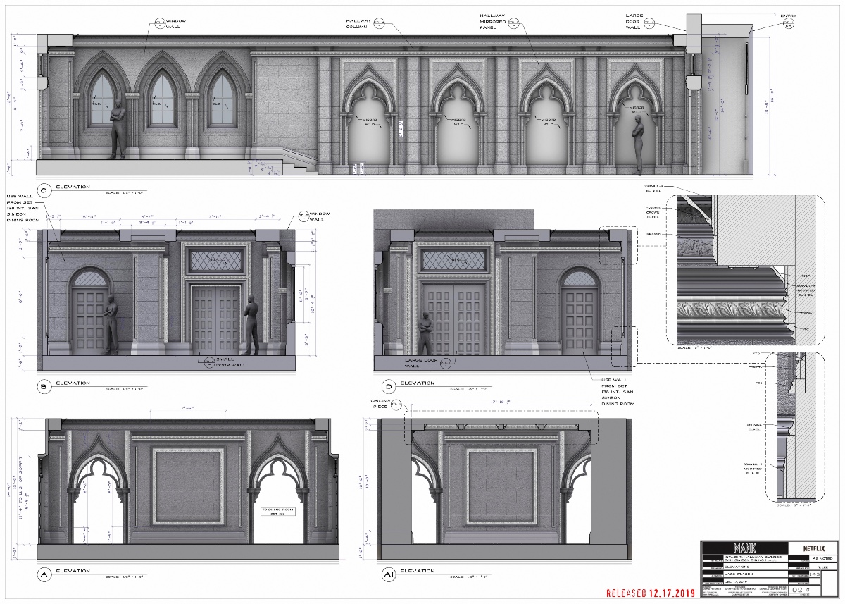
All photos courtesy Netflix and Donald Graham Burt. Click on images for larger versions.


