 Los Angeles-based production studio Roger recently helped rebrand the new Canadian preschool network Family Jr., part of DHX Television’s suite of channels. The realigned network and its French-language counterpart, Télémagino, are geared towards children aged two to five.
Working closely with Family Jr.’s in-house creative team, Roger, led by creative director Rich Scurry, developed an on-air brand strategy and look for the network, including a custom logo, story-driven promos and station IDs.
“Roger’s interpretation of the Family Jr. and Télémagino brands, which are all about encouraging active imaginations among our young viewers, reflects what we aspired to capture in launching this new brand and look – the wonder and creativity of young minds, as well as a world to which both kids and parents are instinctively drawn,” said DHX Television creative director Jason Gordon, who previously collaborated with Roger on a brand refresh for the tween-focused Family Channel in 2010. “The collaboration with their creative team was exceptionally smooth, as usual, and Rich not only brought incredible concepts and design chops as a creative director, but also invaluable insight as a parent of a preschooler himself.”
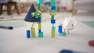
The new graphics package is highlighted by a cast of geometric, paper-textured characters that come to life to tell engaging micro stories. Roger combined stop motion-like techniques and 3D designs with hand-drawn character limbs and eyes to create characters that were distinct to Family Jr.
 From the outset, Roger and the network creatives emphasized making the Family Jr. brand tactile, simple, playful and smart. Paper, a time-honored kid’s art medium for drawing, coloring, cutting and pasting, was the obvious choice for conveying tactility through various textures across the package.
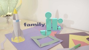
The animators combined a loose animation style with handmade custom typography. Roger created two custom typefaces for Family Jr., a handwritten font and a modern sans serif font. The hand-drawn font has a pencil grain aesthetic, while the sans serif appears to be a paper cutout.
Like the characters in the station IDs, the new network logos – for both Family JR and Télémagino – are created from primitively designed geometric shapes, which are playfully stacked together like building blocks.
“Family Jr. was exceptionally cognizant of their audience going into this rebrand,” said Scurry. “Although they can’t yet read, these young viewers are still receptive to letters and basic shapes, so we made the logos intuitively and visually relatable to them. We also spent a great deal of time making what were complex animations intentionally unrefined.”


