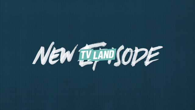
 Los Angeles-based creative production studio Roger recently partnered with TV Land on a comprehensive rebrand, including a new logo and on-air look. The rebrand coincided with a major programming shift as the network launched a line-up of original content aimed at consumers in their 30s and 40s.
“This is the network’s biggest brand shift in the last two decades, so it’s a huge statement for our audience,” said Michael Waldron, TV Land’s VP creative director art and design. “Everything about our new visual identity presents us as a modern network in a new voice for Generation X, from faster pacing of content to a louder, more direct voice of delivery.”
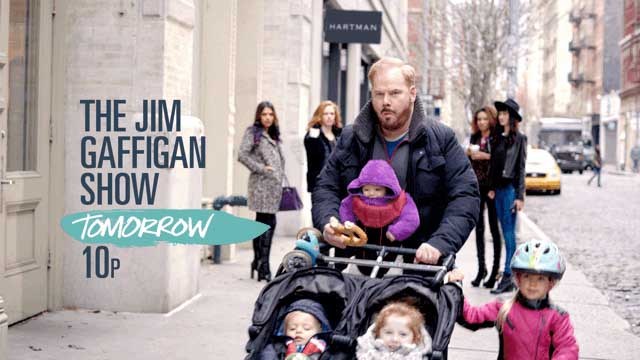
TV Land’s shift to original scripted content began in 2010 with Hot in Cleveland and it continued with the single-camera comedies Younger, The Jim Gaffigan Show and Impastor, as well as the upcoming premiere of Teachers, all scripted shows that veer away from the traditional sitcoms for which the network has been traditionally known.
“This was really about wholly rebooting the perception of TV Land, and the design elements needed to reflect that change,” said Justin Meredith, the project’s creative director for Roger.
 As part of this change, Roger and TV Land set out to create a cross-platform look that felt emotive and raw, yet high-end. They started with the logo by separating it out from the square-shaped TV set that it had occupied since the channel’s inception. The new logo features an all-caps wordmark on a folded banner background, a design theme for the entire rebrand.
Roger then created a design package based on this aesthetic. In addition to an original handwritten typeface by designer MK Fabila, the package includes a library of image sequences and paper textures, which Roger captured in-camera before delivering the toolkit to TV Land’s in-house team.
The elements also support TV Land’s website, out-of-home print, business cards and stationery as well as promotional swag.
“Quality, cleverness and truth translated into a look that needed to feel approachable and tactile,” said Terence Lee, Roger owner/executive creative director.
“… We wanted to take an analog approach to crafting the look of TV Land. This meant taking out some paper, pencils, paint and scissors and getting our hands dirty, literally,” said Terence Lee, Roger owner/executive creative director. “The use of real hand-painted typography, real torn paper and stop-motion animation is really felt throughout the package. It creates a ‘voice’ for the network that wouldn’t feel as authentic as if we had just made everything on the computer.”
This philosophy also drove the music direction and sound. TV Land wanted to keep it modern, but also reference songs that would be familiar to their audience. One way they achieved this was selecting contemporary indie covers of classic ’80s hits by artists such as Depeche Mode.
“We wanted to get away from the pop, glitz and slickness of other more Millennial-leaning networks,” said Meredith. “Gen Xers are a group of people who came up on the punk rock DIY ethos. TV Land aims to identify honestly with their mentality, whether they’re reaping the benefits of the dot-com boom, are jaded employees, or somewhere in between. We wanted the look of the brand to represent content that speaks to them.”


